H
aving the right colors can make a difference on a company’s profit or loss statement.
When a consumer walks into a store, the first thing she sees is color. Whether she is looking for
upholstery fabrics, carpets, towels, sweaters, socks or a new winter coat, if she doesn’t like the
colors she sees, chances are she will walk out of the store without looking any further. Although
the consumer is the final arbiter, her choices are felt throughout the supply chain. It’s up to the
retailer, designer, converter and spinner to select and match the right shades for the right
products each season.
Color forecasting, selection and matching have become an important part of the fashion and
home textile business. Many fiber companies have color experts on staff to advise direct and
indirect customers. There also are trade associations that track color and companies that are in
the business of color for products as diverse as printer inks, cosmetics, automotive interiors,
industrial products, contract design and apparel.
The first color forecasting service in this country, The Color Association of the United
States (CAUS), was established in 1915. Originally called the Textile Color Card Association of the
United States (TCCA), it was formed by the wool and silk industries, which needed color information
to market their fabrics. They were joined by thread, button and apparel manufacturers. TCCA issued
twice-yearly color cards, gave directions in color trends to the apparel market, offered formulas
for each forecasted color to members, and provided a center for color information. Fall/Winter
color cards were dyed in wool, Spring/Summer in silk.
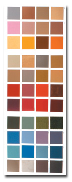
The Interiors 2004/2005 color forecast released by The Color Association of the United
States (CAUS) shows the mercurial buff and brown shades in combination with yellows and pinks for
this year’s home fashions.
Photograph courtesy of CAUS
Color Standards Set In The 1920s
In order to have each shade of color be the same in every American industry, TCCA
standardized a list of staple colors. There were 110 colors in the first edition, issued in May
1915, on 5,000 cards under the title “Standard Color Reference of America.” In the 1920s, TCCA
developed an association with the US government and Armed Forces to standardize colors for military
uniforms, ribbons, decorations and flags.
Now in its tenth edition, the Standard Color Reference of America shows 192 colors including
Khaki, Light Olive Drab, West Point Grey and Marine Corps (blue) for the US Armed Services; Old
Glory Red and Old Glory Blue for the US flag; Princeton Orange, Harvard Crimson and Yale Blue for
Ivy League colleges; and official flag colors of nearly 20 foreign countries.
“Standard colors don’t change very often,” said Margaret Walch, CAUS director. “The Army
keeps the same shades. Can you imagine a parade with sailors all wearing different shades of navy
blue? A color isn’t standardized unless there is a reason. Schiaparelli Pink was standardized in
1937. It’s becoming popular again.”
In 1952, TCCA came out with the first Upholstery and Drapery Fabric Color Card. This was
expanded to include the entire home furnishings industry in 1969, and today is known as the
Interior Colors Forecast. Walch referred to it as colors for interiors and the environment.
In December 1955, TCCA’s Board of Directors changed the association’s name to The Color
Association of the United States in order to encompass the broader focus of the organization.
Today, CAUS serves man-made fibers, home furnishings, floor coverings, wallpaper, household
appliances, paints, plastics, automobiles, motion pictures, television and radio, along with
apparel industries. It is supported through membership dues.
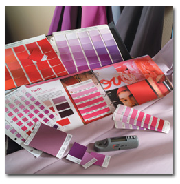
Pantone Inc.’s color charts are used to communicate color along the supply chain.
Creating Color
The Interior Colors Forecast is issued annually. A committee of industry experts in a
variety of areas of home and product design markets meets at CAUS headquarters in New York City to
discuss and select colors for each season. The color card comes out two years in advance and is
used for interiors, including residential and contract; graphic, product and industrial design;
automotive; packaging; and media.
For apparel there are separate color cards for women, men and children. An activewear card
is distributed once a year for the Sporting Goods Manufacturers Association (SGMA) International,
North Palm Beach, Fla., for The Super Show®. It contains 24 colors – 12 for Spring/Summer and 12
for Fall/Winter. The apparel committees are composed of color professionals from fiber companies,
textile mills, converters, fashion designers and major retailers.
CAUS members have access to the association’s vast archives, with color cards and swatches
dating back to 1915. Walch, who is the author of three books on color and teaches a course on color
at the Fashion Institute of Technology (FIT), New York City, is a source of information on color
tastes, trends and history.
Monthly workshops at CAUS offices go into topics relating color to lifestyle. Recent
meetings have covered the trend to pattern in fashion, interiors and graphic design; modern black
and corporate dress. Annual color symposiums take place every September. These two-day events
feature panel discussions and workshops. A bimonthly newsletter contains color information such as
interviews with committee members about seasonal color selections, current trends, news and events
relating to color.
Colors to watch, according to Walch, are purple and yellow. “We’ve had pinks and reds for
several seasons. Purple is the next step. It will go into all areas, from home to apparel, even
menswear, where we see it starting with raspberry.”
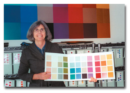
Margaret Walch, director, The Color Association of the United States
Matching Color
Communicating color throughout the supply chain on a global basis is the major focus of
Pantone Inc., Carlstadt, N.J., which has offices and licensees in more than 100 countries. Pantone
colors are used in the graphic arts, textile, apparel, interior, plastics, architectural and
industrial design markets throughout the world. Founded in 1962 by Lawrence Herbert to produce
accurate color matches in graphic arts, the company has over the past 40 years expanded its reach
to other industries. Today, Pantone has added separate color systems for textiles, architecture and
interiors, and plastics.
Lisa Herbert, executive vice president, textile, home and fashion and TheRightColor, said
the Pantone Textile Color System® for apparel and home was launched in 1984 with about 1,000
colors. Today, there are 1,932 colors and a variety of products. All are available in cotton or
paper format. There is a separate system for architecture and interiors that allows designers to
connect different categories within the industry, including flooring, leather, fabrics, carpet,
fiber, furniture and laminates.
For apparel, the Pantone textile color system is essential to coordinate lines.
Manufacturers and retailers can specify Pantone color numbers from separate suppliers to get exact
color matches, so knitting yarns, bottomweight fabrics and prints work together.
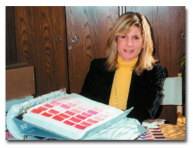
Lisa Herbert, executive vice president, textile, home and fashion and TheRightColor,
Pantone Inc.
Cotton-based products include: a color selector reference book, which contains all of the
textile colors dyed on 100-percent cotton chips; a three-volume color swatch file with
2-inch-square removable swatches arranged by color family; and separate 4-inch-square swatch cards
of each color that can be cut into smaller pieces for distribution to multiple production
locations. Eight-by-10-inch swatches of the 475 top-selling colors also are available.
The paper color specifier book shows color arranged tonally, with six tear-out chips for
each color. Generally, there are seven colors per page. Replacement pages can be purchased
separately. The paper color guide is in the form of an easy-to-view fan. Colors are arranged
chromatically.
All of the color guides are written in seven languages. Colors are named as well as
numbered. Herbert explained the color numbering system: “The first two numbers refer to depth of
color, the last four designate shade.”
New technology recently introduced includes the Color Cue™ TX. The size of a flashlight,
this spectrocolorimeter has been preprogrammed with Pantone’s Color System and can immediately
identify the closest color of any flat surface with the click of a switch.
Digital access also is available and can be incorporated into most design software because
most computer printers use Pantone colors. For textiles, along with the basics, additional colors
are available.
Herbert explained that because different light can change how a color looks, all Pantone
shades are viewed under a daylight standard, D-65.
If someone needs a color that is not one of the 1,932 in its system, Pantone’s color lab
will develop the shade and dye sample yardage. Brooks G. Tippett, director of textile operations
and development, said custom color dyeing services to textile clients can dye up to 150 yards of
fabric. Pantone uses Roaches dye machines. Fabrics are washed, flat-dried and allowed to condition
in a light- and humidity-controlled environment.
All of Pantone’s colors on cotton are in stock. When a color needs to be redyed, the history
of that color is evaluated and compared to all previously dyed fabrics. Colors are visually
analyzed using a spectrophotometer, which reads the reflectance of light and gives numerical
values. A reading of 1.25 is considered acceptable. Pantone’s rigid standards to keep color
consistent from year to year raise that standard to 0.45.
Digital color communication has become an increasingly important tool. “It can save time and
cost substantially,” Tippett said. “A designer in New York can approve a lab dip from China in a
much shorter time.” Pantone works in partnership with eWarna.com: Pantone formulates a color, which
is read into the spectrophotometer and goes into the eWarna database. This information is
immediately received in China. It is so accurate and immediate that it eliminates sending lab dips
back and forth for approval, according to Pantone.
Tracking inventory levels gives Pantone insight into color preferences and trends. Of the 20
top-selling swatch cards, the number-one- and -two-ranked colors are Bright White and Snow White.
Stretch Limo (black) is number three, followed by Biking Red and Peacoat. There are four shades of
red, four whites, one gray, one yellow, one pink and eight blues on the list.
Pantone’s involvement in fashion is increasing. Recently, it became a sponsor of New York’s
Fashion Week, and it is producing seasonal color trend books and reports. The Pantone View Color
Planner is a bi-annual trend-forecasting tool that offers color direction 24 months in advance. It
is geared to menswear, womenswear, activewear, cosmetics and industrial design.
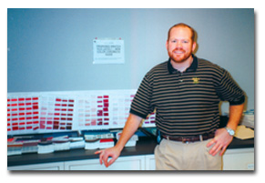
Brooks G. Tippett, director, textile operations and development, Pantone Inc.
Making It Work
Color forecasting has come a long way since the first standardized list of staple colors was
introduced in the early 20th century. With the expertise of color consultants and trade
associations now widely available, color has become the springboard for many of the looks and
designs the consumer sees in apparel and home furnishings, among many other markets.
Color has become the basis for important choices made throughout the supply chain –
from spinner to converter to designer to retailer. Making the right color choice makes the
difference – a satisfied consumer.
January 2004


